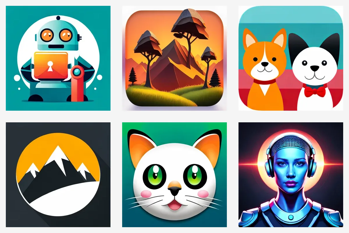
An app icon prompt is not a normal image prompt. A poster or illustration can hold a whole scene. An icon has to read at 60 pixels on a home screen, next to a hundred other icons. Most bad AI icons come from prompts that ask for too much.
Below are six prompts and what they produced, followed by the rules we'd take from them.
Six prompts and what came back
These are the icons in the image above, left to right, top to bottom.
Robot teacher→ a friendly robot with an orange screen on its chest. Works: two words, one clear subject.3D sunset, mountains, trees around→ a low-poly mountain scene at sunset. Nice illustration, weak icon: at home-screen size the trees and peaks blur together.Cat and dog, cartoon→ two cartoon pets side by side. Both look like dogs, and each face gets half the space it could have.Golf, snow, mountain, ski→ a single snowy mountain in an orange circle. The model dropped golf and ski. Four subjects is too many, so it picked one.ChitCat→ a white cat face with big green eyes. The model guessed from the word "Cat". An app name alone gives it nothing else to go on.Robot voice, microphone, AI→ a blue humanoid face wearing headphones. No microphone. "AI" pulled the result toward a sci-fi portrait.
Two of the six (1 and 5) did what the writer wanted. The rest show the usual failure modes: too many subjects, a scene instead of a symbol, and abstract words the model fills in on its own.
1. Pick one subject
The strongest icons are one object or one character. If your app does several things, choose the one that matters most, or find a single object that stands for it.
- Weak:
Golf, snow, mountain, ski - Better:
A skier carving down a snowy slope - Better still:
A single ski pole planted in snow
2. Describe things, not ideas
Words like "AI", "productivity", "fast" or "smart" have no fixed look, so the model invents one. Say what should be visible.
- Weak:
Robot voice, microphone, AI - Better:
A small round robot speaking into a vintage microphone
3. Name your colors
Color is the main way people find your icon on a crowded screen. If you have brand colors, put them in the prompt: orange robot on a deep teal background. The generator tells the model to keep the colors you name.
4. Leave the style and background out of the text
In Appicons, the art style (vector, digital art, minimalistic, 3D, flat or retro) and the type (app icon or logo) are separate settings. The generator turns them into instructions for the model. It also asks for one focal point, a silhouette that stays clear at 32–64 pixels, a square canvas and no device mockup or border.
So your prompt only needs the subject and colors. Writing "flat, minimal, 3D, white background" in the text can conflict with the style you picked.
5. Only ask for text if you need it
The generator adds lettering only when you ask for it. If you need letters, put the exact text in quotes and keep it short: the letter "C" made of a speech bubble. A full app name is usually unreadable at icon size anyway.
6. Don't rely on your app's name
ChitCat worked by luck. Lumo or Nestly would not. Describe what the app is about: a cat face inside a chat bubble.
7. Check it small before you choose
Once you have a few results, shrink your favorite to thumbnail size or put it on your phone's home screen. If you can't tell what it is at that size, simplify the prompt or try the minimalistic or flat style.
For the exact sizes, masks and safe zones, see Apple's app icon guidelines and Android's adaptive icon guide. The Appicons.ai export pack already follows both.
Getting more out of a result
- Use the prompt enhancer if you only have a rough idea. It turns a few words into one tighter description without changing your subject. See how the prompt enhancer works.
- Edit instead of starting over. If an icon is close, ask for a specific change ("make the background darker", "remove the second tree") rather than writing a new prompt.
- Start from a reference image if you already have a sketch or an old icon. Reference images work with every style except vector.
- Choose vector if you need an SVG. Vector results start from text only.
Quick checklist
- One subject
- Concrete objects, not abstract ideas
- Colors named
- Style picked in the settings, not written in the prompt
- Text only if needed, in quotes, one or two characters
- Checked at home-screen size
Ready to try it? Create your app icon — credit packs start at $10.